CONTRAST
D&D Beyond
D&D Beyond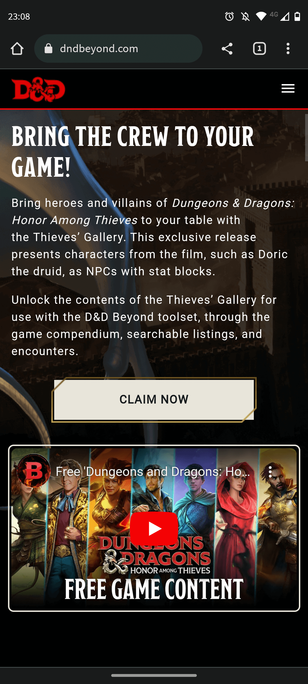
The contrast is one of the main principles since it is about the differences, on the page we see the different elements, such as text, images, buttons, videos maintain a contrast between them, allowing to make clear the reading of the site and to have a pleasant view of all the information.
Every good design has a strong and clear focal point and having a clear contrast between the elements helps.
ALIGNMENT
Foundry VTT
Foundry VTT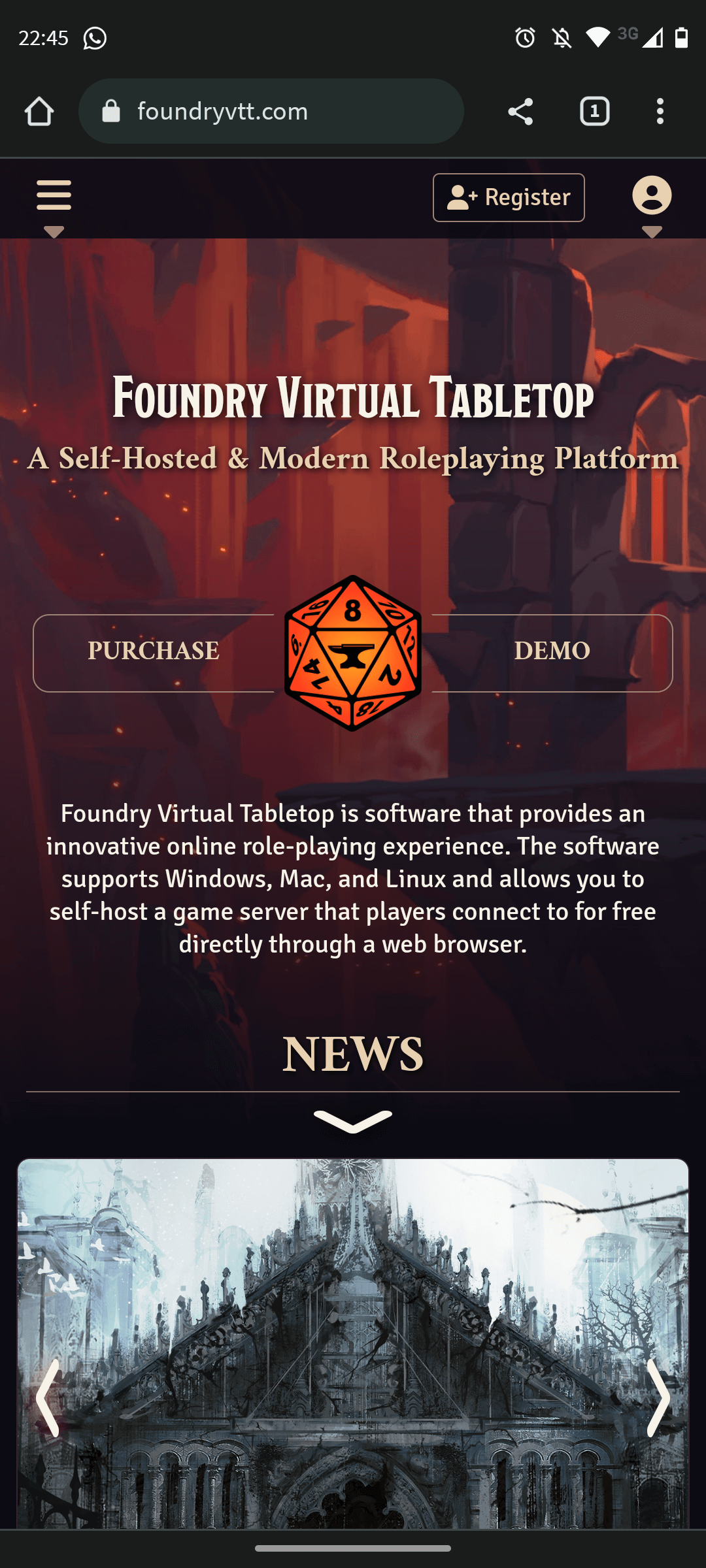
In the alignment on this web page I like, both the titles and the other elements and highlight the given that is where the view focuses almost immediately. It looks organized and there is a purpose that fulfills the objective of guiding the user to what is most relevant.
The way they are distributed shows that it would be easy to use a grid to align each of the elements. And in general, they show a visual connection.
WHITE SPACE AND CLEAR DESIGN
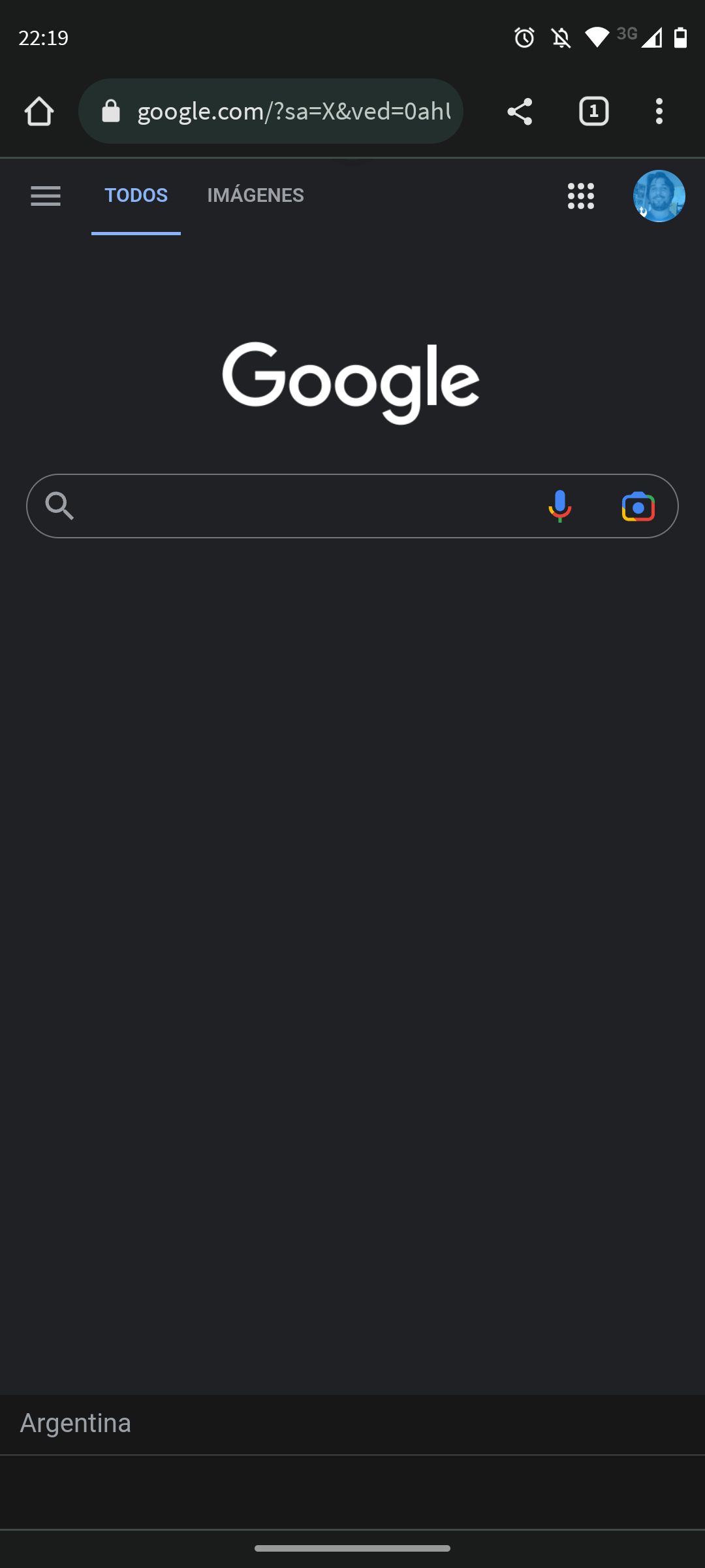
As seen on the page, we see a clear example of the use of white space macros providing not only simplicity but a balance between the elements. In this specific case, it focuses the view on the objective and does not distract the user but acts as a container for the design in general.
The macro white space on the page helps maintain order, providing the right and necessary elements for what the site was created, which is the search for something.